Clover
Brand Identity, Environmental & Interior Design
Orthodontics
Brand Strategy · Identity · Packaging · Environmental Graphics · Interior Design
What if the orthodontist was somewhere you actually looked forward to going?
Orthodontics has an image problem. Fluorescent waiting rooms, clinical tile, the low hum of dread. Clover, a West Hollywood practice for the Invisalign generation, wanted the opposite — a place people would post about, not avoid.
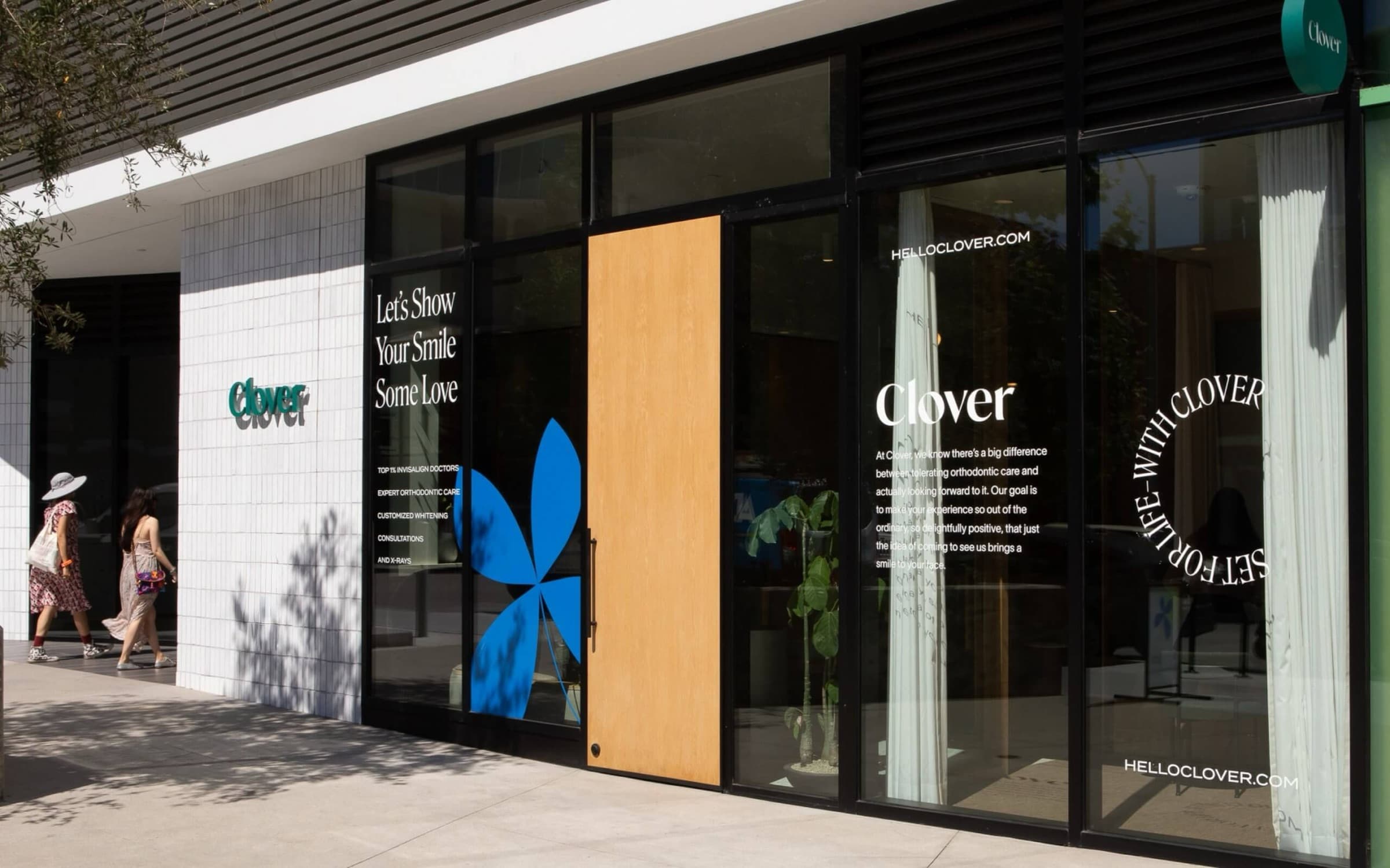
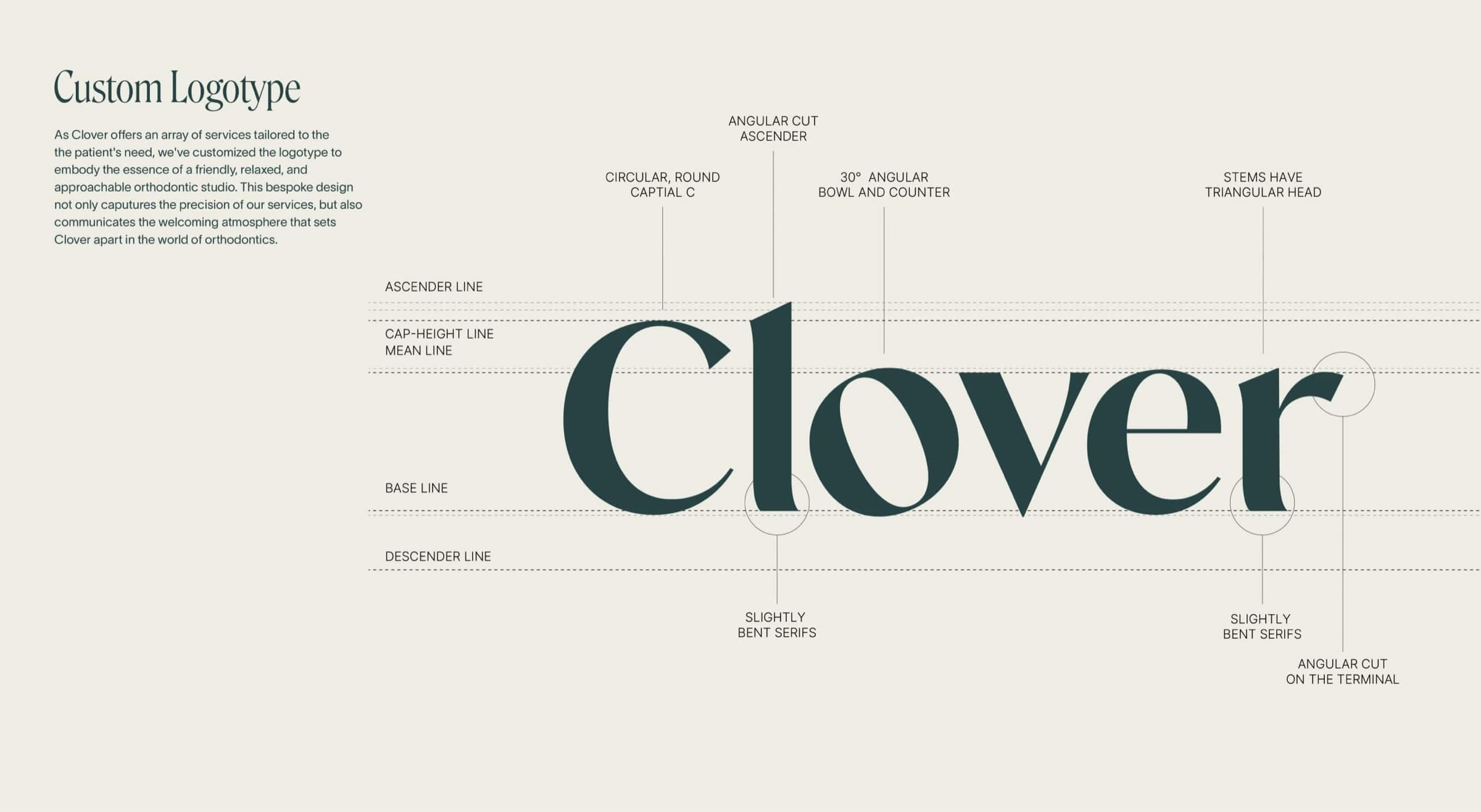
We built the identity around a single gesture: a petal that doubles as a smile. A confident editorial serif carries the wordmark; a cobalt bloom carries the personality. Warm and clinical at once — precise enough to trust, soft enough to love.
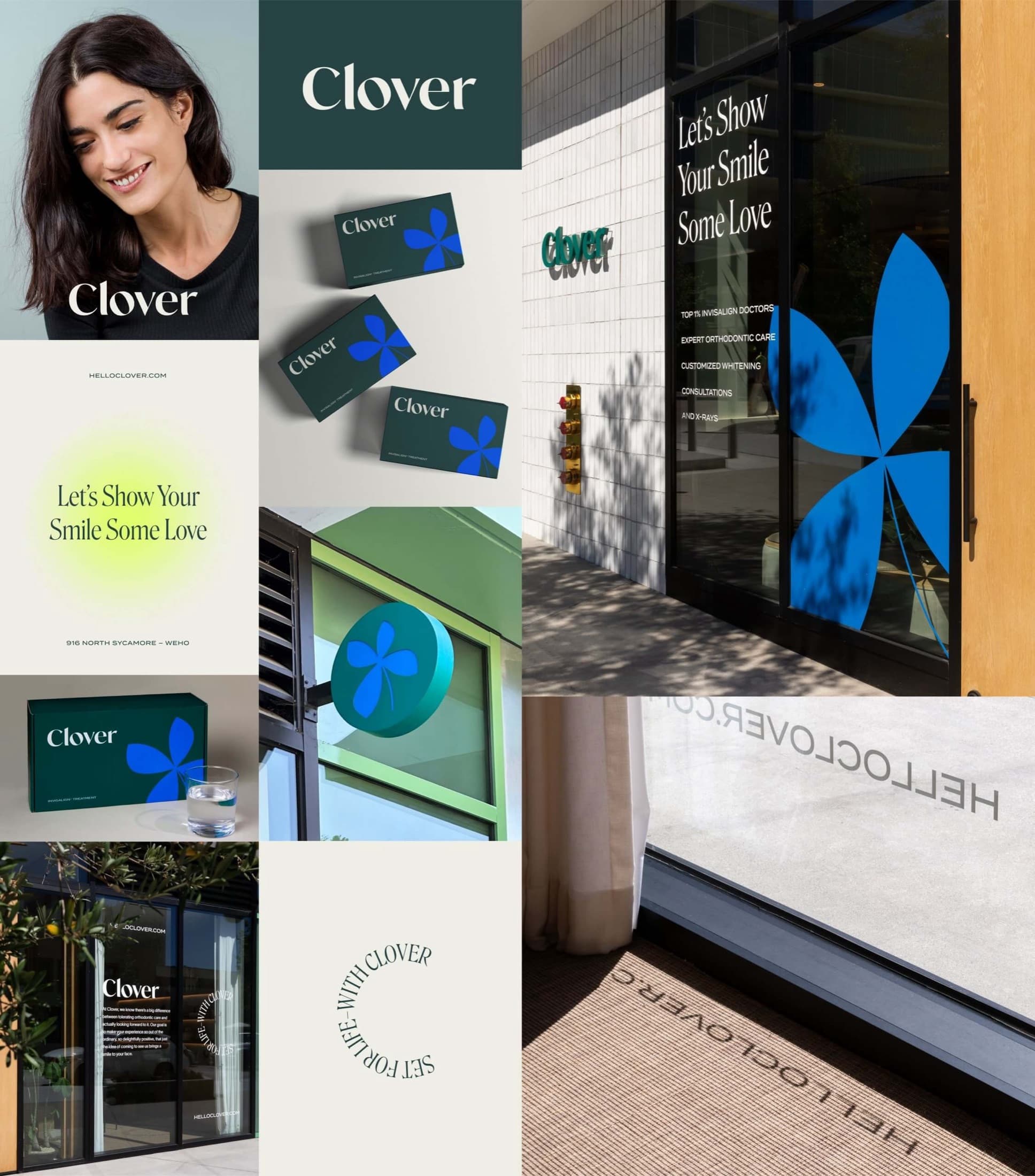
Let's show your smile some love.
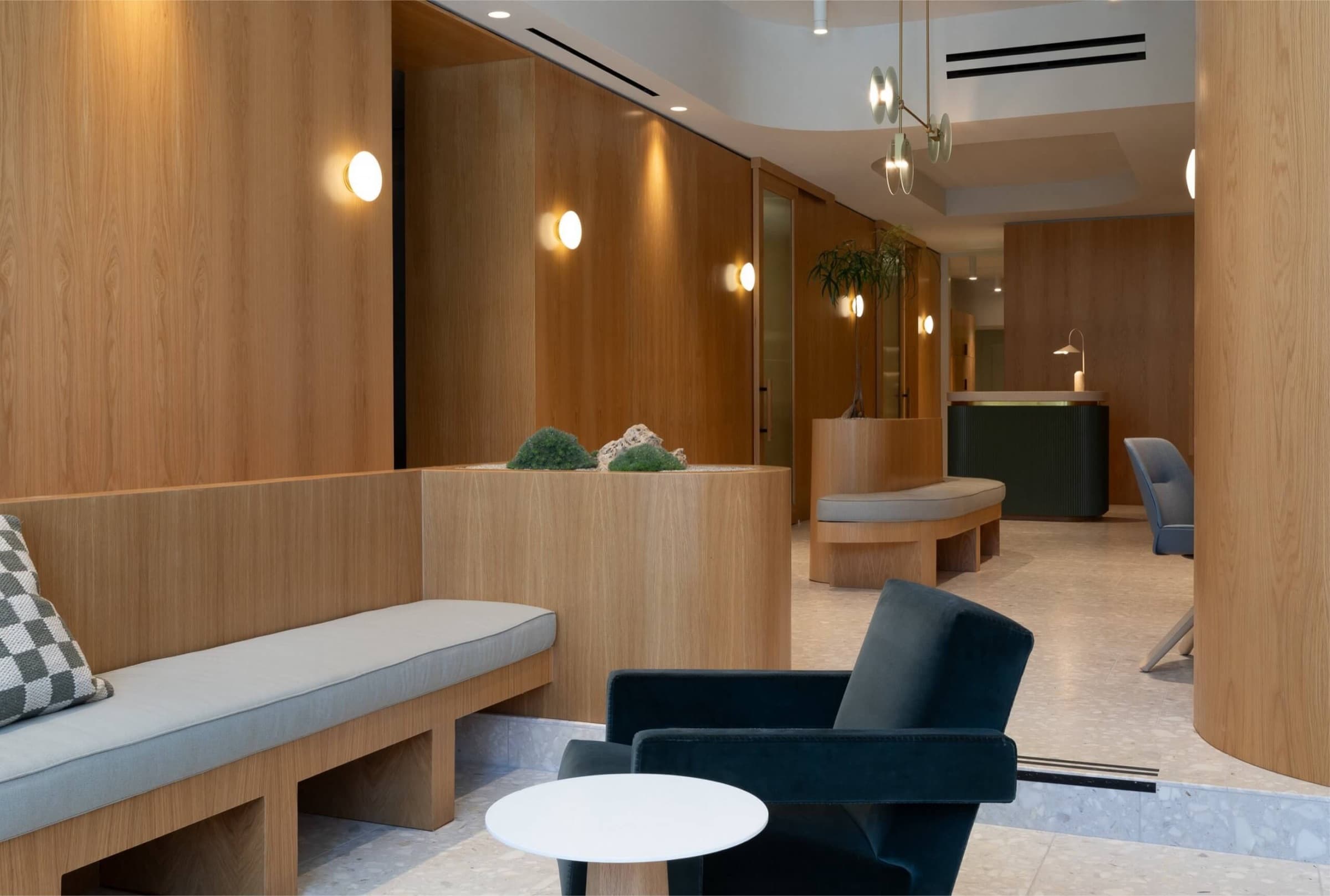
Inside, the language turns architectural. White oak wraps the walls in one continuous grain. Terrazzo underfoot, moss and stone set into built-in planters, opaline sconces throwing a soft glow. It reads less like a clinic and more like a very calm hotel lobby.
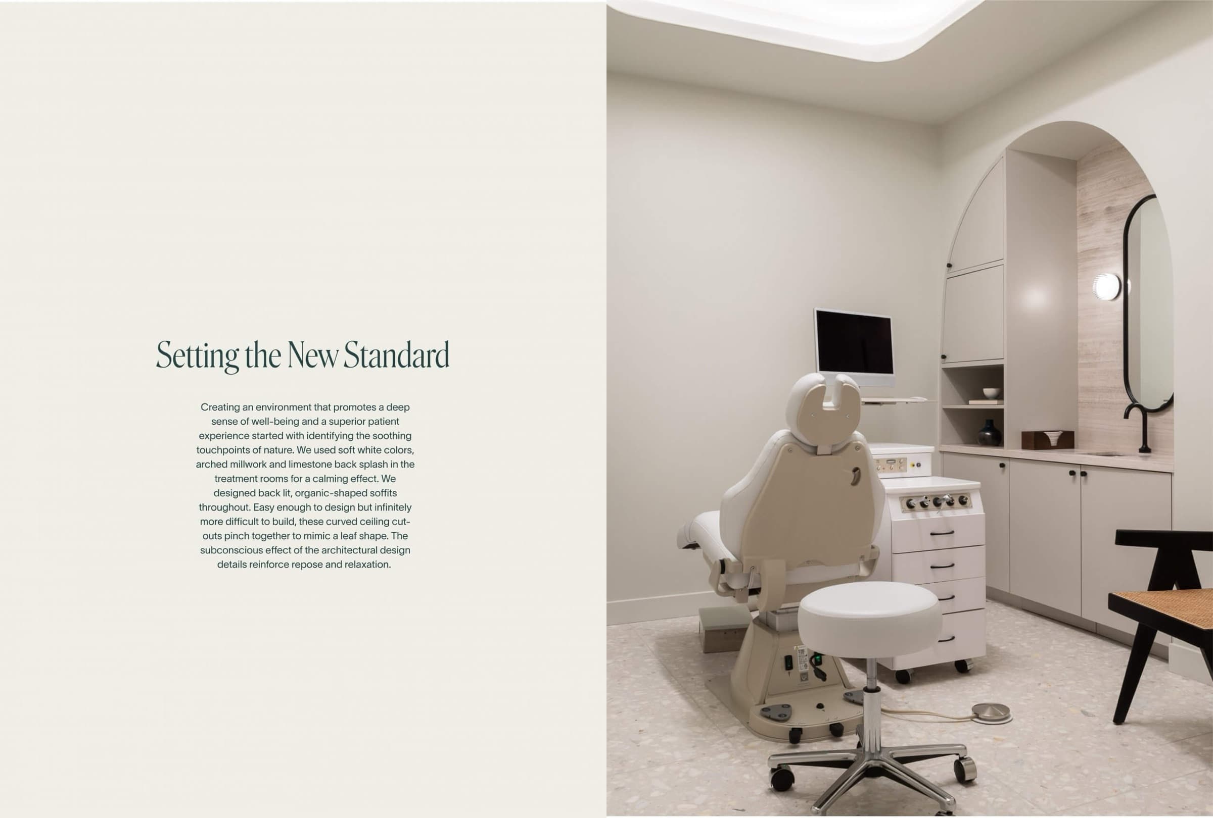
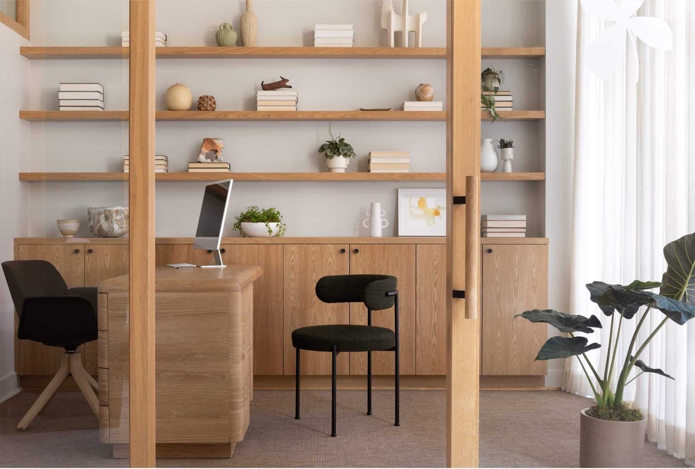
The result is a practice that feels like a destination. Every surface — from the box a retainer ships in to the door you walk through — carries the same idea: care you'd choose, not care you tolerate.