Origin
Brand Identity & Campaign
Women's Health
Brand Strategy · Identity · Art Direction · Campaign · Print
Healthcare for the female body that finally feels like it's on your side.
Origin treats the female body — pelvic health, pregnancy, the parts of care that clinics keep in beige rooms and hushed tones. The brief was to make it loud, warm, and unmistakably optimistic. Care worth being seen with.
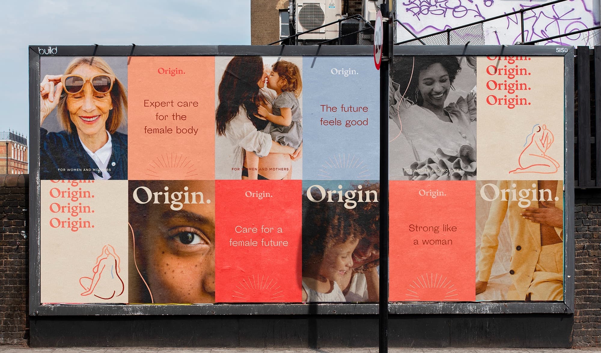
The mark is a single word with a full stop — Origin. — set in a warm, literary serif that carries authority without the cold. Around it, a sunrise: a small radiating motif that turns up on every card, every corner, every headline.
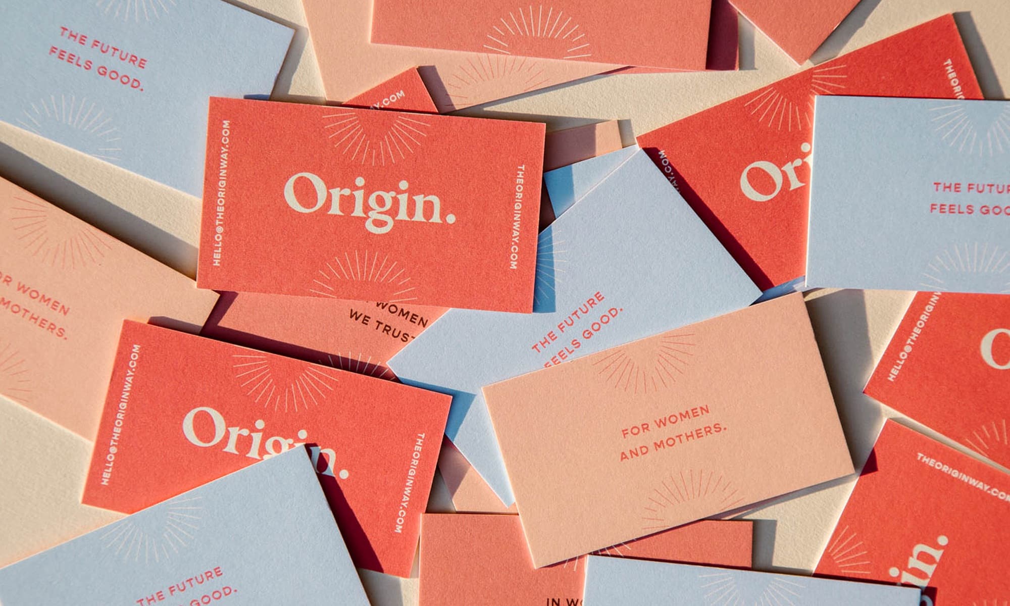
For women and mothers. The future feels good.
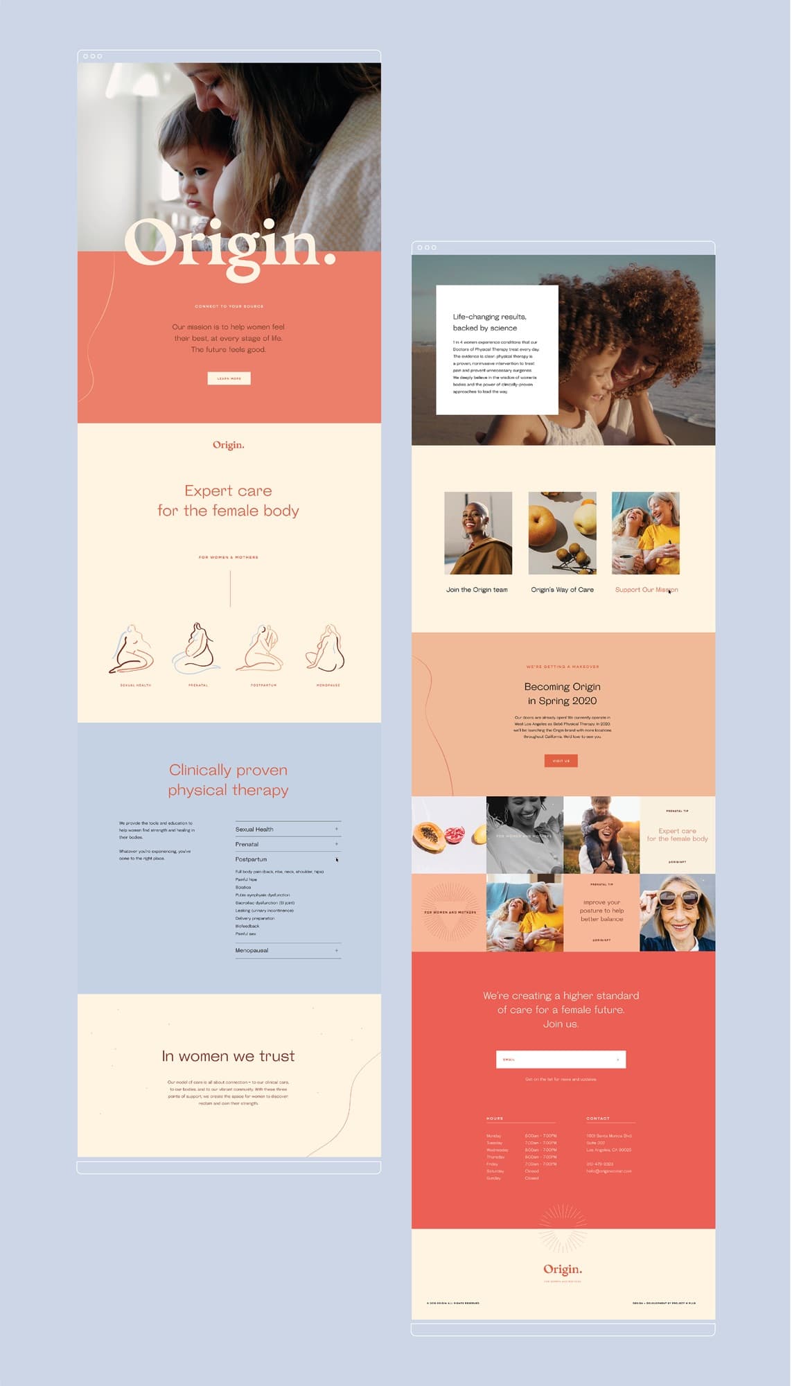
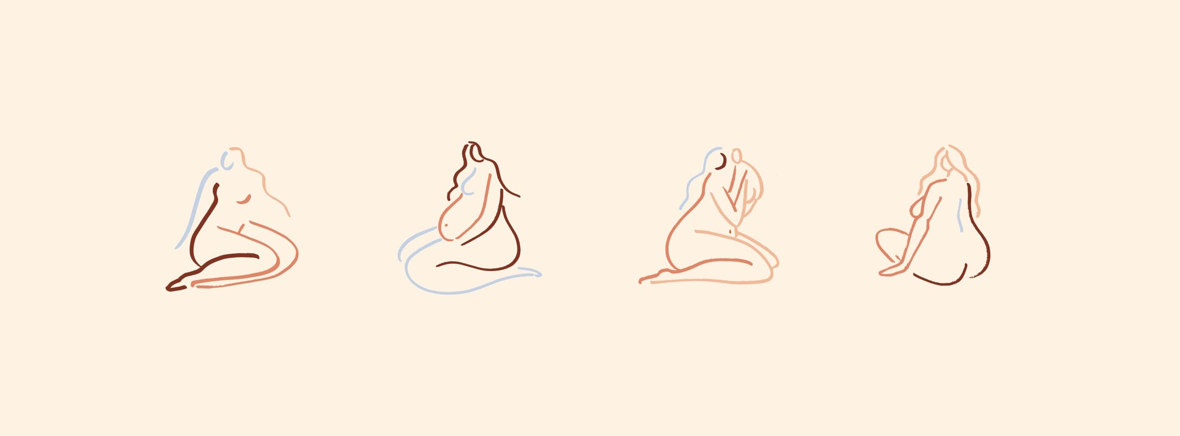
A set of single-line nude illustrations runs through the system — bodies drawn in one continuous, unbothered stroke. They keep the brand human and disarming exactly where healthcare usually turns clinical.
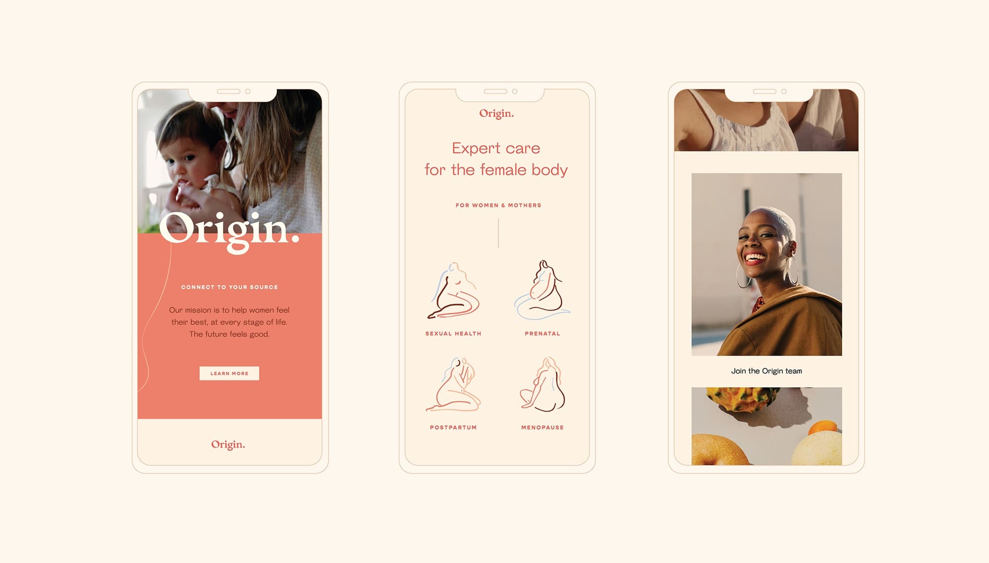
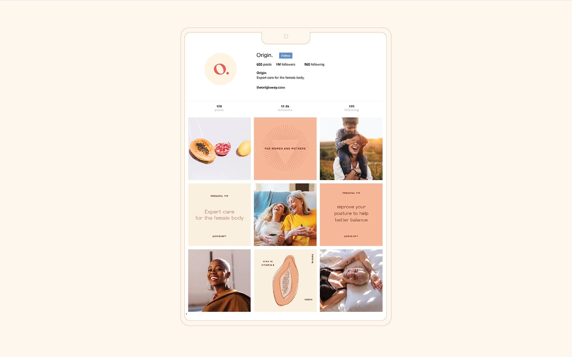
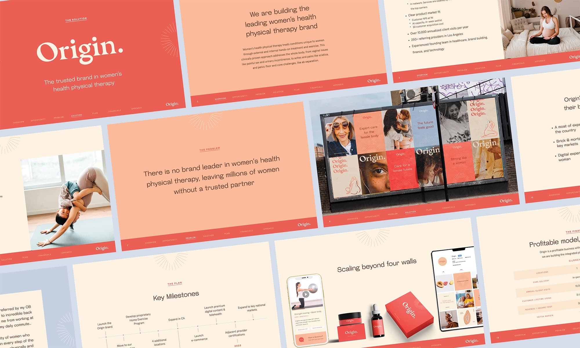
The through-line is confidence. A category that usually whispers, given permission to speak plainly and look forward. Expert care, dressed like something you'd actually want.